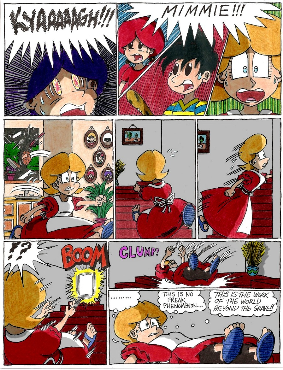
Chapter 1 - Page 33: A Force Beyond Control

kenisu - #33
Shading can be a beast on pages like this one.

kenisu - #33
Shading can be a beast on pages like this one.

Author   |
Title   |
Description   |
Date   |
Rank   |
|---|---|---|---|---|
| kenisu3000 | Frankystein Mark I |
Not Mark II... Mark I!
Oddly enough, the post I uploaded this to in the forum got a downvote. Apparently, someone has a childhood trauma involving Jack-in-the-Boxes (well, I know *I* do, but...). |
4/17/09 | 0.00 |
| kenisu3000 | Chapter 1 - Page 58: Of Oreos and Hocus-Pocus |
kenisu - #58
I've always felt the livingroom was awfully... stark. I designed it similar to what's seen in the game, knowing full well how bland and... I dunno, threadbare(?) it looked, but I wanted to keep it that way, just for a laughable throwback to the simple 8-bit design of the game. But dang, after drawing and coloring all these pages, it seems to me that I should have at least succumbed to wallpaper, windows and a light fixture! What kind of psycho house -doesn't- have windows around its front door? And without those windows or an immediate light source aside from the kitchen window, how could it be so bright indoors? That's the price of adhering 100% to the game's design for the house's exterior first, THEN putting together the interior. You look at the inner layout and realize it doesn't conform to the outer structure at all. In the game, the front door, as seen from the the livingroom, is brown and square at the top, with no built-in window, but outside, it's gray with a rounded top and window, AND the doorknob's on the wrong side! So I changed it to fit the outside appearance. At least that's one claim to consistency I can make. I need a life. |
5/3/09 | 0.00 |
| kenisu3000 | Chapter 1 - Page 59: Dumb Animal He Ain't |
kenisu - #59
I apologize for making Mick a smoker. Since he stands on two legs, I kept seeing this image in my head of him leaning casually against his doghouse, and from there it's easy to see how a cigarette found its way into his mouth. Of course, this begs the question: Where, when and how did he pick up this habit? Peer pressure from the local crows? |
6/15/09 | 0.00 |
| kenisu3000 | Chapter 1 - Page 60: Keys 'n' Things |
kenisu - #60
You may remember that when Minnie and Mimmie were first introduced, they spoke in unison and had the same personality. There's the old cartoon cliche of twins being "of one mind" (and in some extremely annoying cases, displaying this aspect by finishing each others' sentences). However, I soon decided to break this unspoken rule and make them virtually polar opposites. Now, Minnie, being older (albeit by only a few minutes), speaks on Ninten's grammatical level and shows much more maturity than her younger counterpart, Mimmie, who still uses "baby talk" and often acts on the same maturity level of her speech. ...I dunno, maybe it's funnier this way...? |
6/15/09 | 0.00 |
| kenisu3000 | Chapter 1 - Page 61: Cellar Scrutiny |
kenisu - #61
When choosing between blacking in the background with ink or colored pencil, I opted for the latter. It was more work, but I like the effect I accidentally created when I blended in the Dark Brown: it gives it a "dusty air" look. Just looking at these panels makes me want to cough. |
6/15/09 | 0.00 |