News:
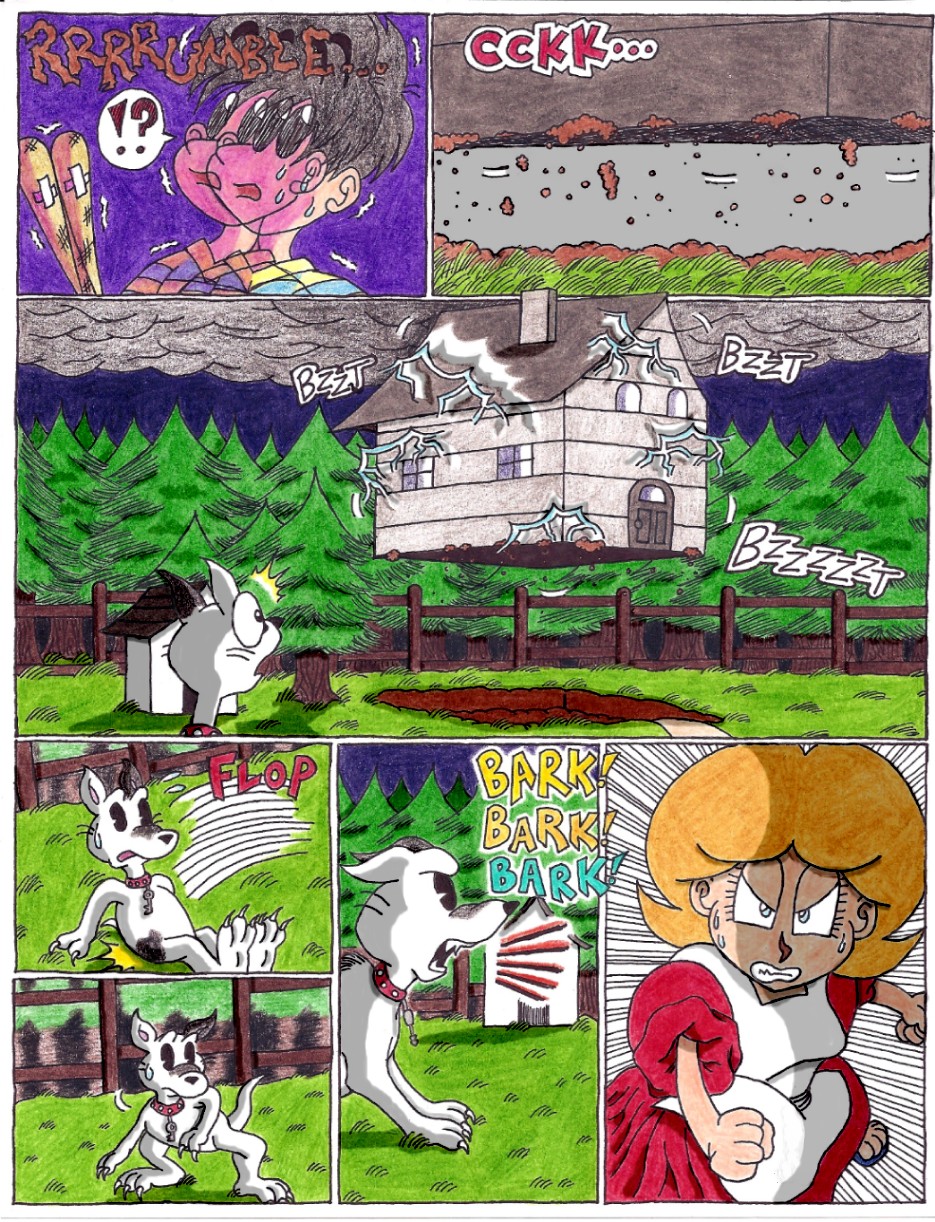
Go Back! Mother1Chapter 1 - Page 38: Raising the Roof - by kenisu3000
Other Submissions by kenisu3000
Author   |
Title   |
Description   |
Date   |
Rank   |
|---|---|---|---|---|
| kenisu3000 | "Whose Hat is This?" coloring book, pgs. 1 & 2 |
whohat - #02
I've found that in the Mother 1/EB Zero universe, there's two types of fans: those who refer to the lead character as "Ninten", and those who call him "Ken" (after Saori Kumi's Mother novel). I'm of the former crowd, but in *this* particular instance I decided to go with "Ken", since it would be just plain weird for a bunch of kids who don't understand the game to be reading about someone whose name is strikingly close to "Nintendo". All the same, it was awfully weird for ME to write the story, since Ken is just a shortened version of my OWN name (Kenneth), which I generally don't like to be called. But anyway, check out Page 2. Since the Paradise Line only has about what, six or seven destinations TOTAL, that's gotta be one tiny catalogue. Either that or they dedicated a whole page to each individual town. |
9/25/06 | 8.00 |
| kenisu3000 | Chapter 1 - Page 58: Of Oreos and Hocus-Pocus |
kenisu - #58
I've always felt the livingroom was awfully... stark. I designed it similar to what's seen in the game, knowing full well how bland and... I dunno, threadbare(?) it looked, but I wanted to keep it that way, just for a laughable throwback to the simple 8-bit design of the game. But dang, after drawing and coloring all these pages, it seems to me that I should have at least succumbed to wallpaper, windows and a light fixture! What kind of psycho house -doesn't- have windows around its front door? And without those windows or an immediate light source aside from the kitchen window, how could it be so bright indoors? That's the price of adhering 100% to the game's design for the house's exterior first, THEN putting together the interior. You look at the inner layout and realize it doesn't conform to the outer structure at all. In the game, the front door, as seen from the the livingroom, is brown and square at the top, with no built-in window, but outside, it's gray with a rounded top and window, AND the doorknob's on the wrong side! So I changed it to fit the outside appearance. At least that's one claim to consistency I can make. I need a life. |
5/3/09 | 0.00 |
| kenisu3000 | Chapter 1 - Page 41: Mimmie Snaps Out of It |
kenisu - #41
It's a sound-effect extravaganza! Except I think I should've gone with "WHUMP!" instead of "BOOF!" when Ninten catches Mimmie. Oh well. |
8/1/07 | 0.00 |
| kenisu3000 | Chapter 1 - Page 54: The Life and Times of Grandpa John |
kenisu - #54
That whole business about Suzannah getting run over by a drunk driver… well, I worried about that. Not because I thought it was too “adult” a theme, but because I suddenly remembered about Prohibition (even though there was still a lot of bootlegging going on during that time anyway), but then I did the math, and chalked up the accident to take place in 1918, two years before Prohibition became a stateside thing. Phew, close call! But THEN, I worried that a Model-T Ford might not have been powerful enough to kill anyone. So I looked it up, and apparently that model was capable of going at excesses of 30 mph, which I don’t doubt is fast enough for a reckless drunk driver to plow over a helpless pedestrian. I hate having to research history. |
4/17/09 | 0.00 |
| kenisu3000 | Chapter 1 - Page 55: The Fateful Night at Pilgrim's Rock |
kenisu - #55
After writing all of this backstory, I realized that, in adhering to the “mother-dominant” theme of the game, Itoi probably intended for George and Maria to be Ninten’s ancestors on his *mother’s* side, not his father’s. Whoops. Oh well, I guess it’s no big deal. |
4/17/09 | 0.00 |


